
Based on this decision, I decided to get a rough sketch of what was going on onto the final Bristol pieces without trying too hard to get every detail mapped out. This ended up being a bit of a mistake. This first go at painting gave me a good chance to look at what sort of palette I wanted to keep consistent throughout the story. I began thinking that I would be using something pretty realistic to life, but as I began a few other paintings, my thoughts began to shift.

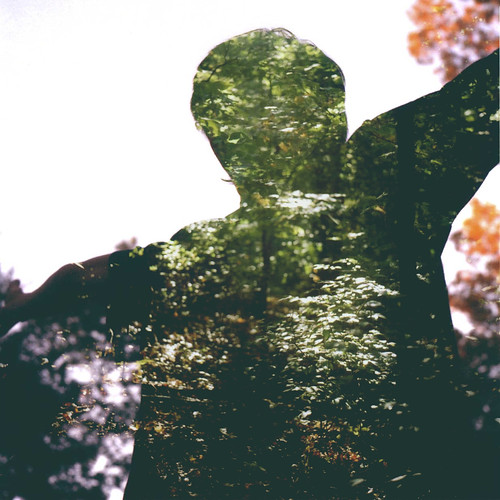
While imagining body contortions and painting styles, I’ve been looking often at the figure studies and paintings of James Jean found in his book Kindling. Jean is a graduate from the School of Visual Arts in New York City, and has been working in the illustration world since 2001. His quality of rendering and his accuracy of figure studies have made him an important point of inspiration. Additionally, his use of layering is on point to the sort of things I hope to achieve.
After starting with more true to life colors, analysis of Jean’s paintings revealed to me the power of subtle shots of color amongst monotone. In pieces such as Swan, the use of a slight yellow pulling through the flowers pops out from the really desaturated rest of the painting, despite the fact that the yellow is not that vibrant. This made me decide that I should make the fields and mountains hold a red/gold overcast while the land sheltered by the trees could have a ghostly green overcast. I think this is gonna give my pages a nicer general feel, and will hopefully make the pages feel more cohesive together in the end.
A lot of painting is gonna start going on this week, so I'll start taking photos of a couple paintings as they develop to show the process.
ahh I LOVE James Jean and he's an excellent source of inspiration for you to be looking at...I can't wait to start seeing the tangibles develop.
ReplyDelete